Front basic
DOM
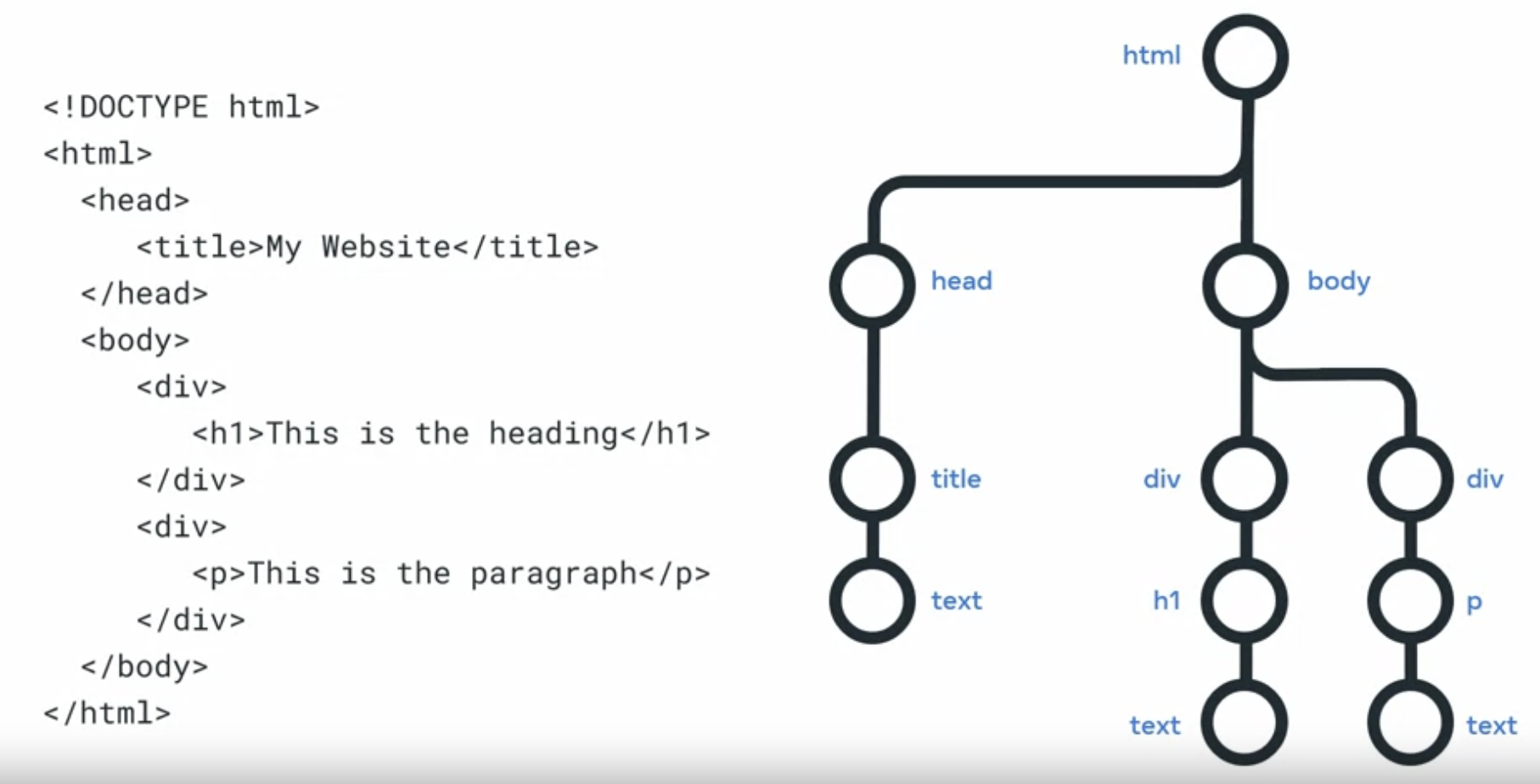
When your web browser receives an HTML page, it constructs a DOM to represent it.
DOM stands for Document Object Model and it is simply a tree, structure or model of the objects in your HTML file.
CSS Basics
Selecting and styling
CSS tells the web browser how to display HTML elements on screen.
For an HTML web page to use a CSS file, you need to link the CSS file to the head element of the HTML file. You use the link tag to link to a style sheet, which must be assigned to attributes rel and h ref.
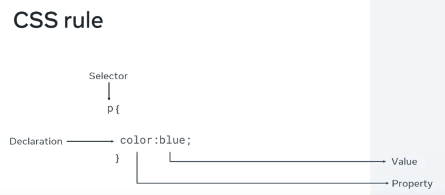
Selector: The selector is the part of a CSS rule that identifies which HTML elements the rule will apply to. In the following example, h1 is the selector, meaning this rule will apply to all <h1> elements in the HTML document.
1
2
3
h1 {
  color: green;
}
The rel attribute is assigned to the style sheet, and the href attribute is assigned to the name of the style sheet file.
If you want to style only a single h1 element, you can add an ID attribute to the tag you want to style. In the CSS file, you create a rule for that ID.
CSS precedents and specificity
The browser will use the most precise selector for an HTML element.
Element Selectors
The element selector allows developers to select HTML elements based on their element type.
For example, if you use p as the selector, the rule will apply to all p elements on the webpage.
1
2
<p>Once upon a time...</p>
<p>In a hidden land...</p>
1
2
3
p {
  color: blue;
}
ID Selectors
The ID selector uses the id attribute of an HTML element. Since the id is unique within a webpage, it allows the developer to select a specific element for styling. ID selectors are prefixed with a # character.
1
<span id="latest">New!</span>
1
2
3
#latest {
  background-color: purple;
}
Class Selectors
Elements can also be selected based on the class attribute applied to them. The CSS rule has been applied to all elements with the specified class name.
The class selector is prefixed with a . character.
In the following example, the CSS rule applies to both elements as they have the navigation CSS class applied to them.
1
2
<a class="navigation">Go Back</a>
<a class="navigation">Go Forward</a>
1
2
3
.navagation{
  margin: 2px;
}
Element with Class Selector
A more specific method for selecting HTML elements is by first selecting the HTML element, then selecting the CSS class or ID.
The example below selects all p elements that have the CSS class introduction applied on them.
1
2
3
<p class="introduction">
 content
</p>
p.introduction{
  margin: 2px;
}
Descendant Selectors
Descendant selectors are useful if you need to select HTML elements that are contained within another selector.
For example:
1
2
3
4
5
6
7
8
9
10
11
12
13
<div id="blog">
  <h1>Lasted News</h1>
  <div>
    <h1>Today's Weather</h1>
    <p>
      The Weather will be sunny
    </p>
  </div>
  <p>Subscribe for more news</p>
</div>
<div>
  <h1>Archives</h1>
</div>
1
2
3
#blog h1{
  color: blue;
}
The CSS rule will select all h1 elements that are contained within the element with the ID blog. The CSS rule will not apply to the h1 element containing the text Archives.
The structure of a descendant selector is a CSS selector, followed by a single character, followed by another CSS selector.
Multiple descendants can also be selected. For example, to select all h1 elements that are descendants of div elements which are descendants of the blog element, the selector is specified as follows.
1
2
3
#blog div h1{
  color: blue;
}
Chile Selectors
Child selectors are more specific than descendant selectors. They only select elements that are immediate descendants (children) of a selector (the parent).
For example, you have the following HTML structure:
1
2
3
4
5
6
7
8
<div id="blog">
  <h1>Latest News</h1>
  <div>
    <h1>Today's Weather</h1>
    <p>The weather will be sunny</p>
  </div>
  <p>Subscribe for more news</p>
</div>
If you want to style the h1 element containing the text Latest News, you can use the following child selector:
1
2
3
#blog > h1{
  color: blue;
}
This will select the element with the ID blog (the parent), and then it will select all h1 elements that are contained directly in that element (the children). The structure of the child selector is a CSS selector followed by the child combinator symbol > followed by another CSS selector.
Note that this will not go beyond a single depth level. Therefore, the CSS rule will not be applied to the h1 element containing the text Today's Weather.
:hover Pseudo-Class
The simplest example of this is changing the colour of a hyperlink when it is hovered over. To do this, you add the :hover pseudo-class to the end of the selector. In the following example, adding hover to the element will change the colour of the hyperlink to orange when it is hovered over.
1
2
3
a:hover{
  color: blue;
}
This pseudo-class is very useful for creating visual effects based on user interaction.
Text and color in CSS
From CSS version 3, there are five main ways to reference a color.
- By RGB value
- By RGBA value
- By HSL value
- By hex value
- By predefined color name
RGB value
RGB is a color model that adds the color red (R), green (G), and blue (B) together to create colors. This is based on how the human eye sees colors.
Each value is defined as a number between 0 and 255, representing the intensity of that color.
For example, the color red would have the RGB value of 255,0,0 since the intensity of the red color would be 100% while blue and green would be 0%.
The color black then would be 0,0,0 and the color white 255,255,255.
When using RGB values in CSS, they can be defined using the RGB keyword:
1
2
3
p{
  color: rgb(255,0,0);
}
RGBA value
RGBA is an extension of RGB that add an alpha (A) channel. The alpha channel represents the opacity, or transparency, of the color.
Similar to RGB, this is specified in CSS using the rgba keyword:
1
2
3
p {
  color: rgba(255,0,0,0.8);
}
HSL value
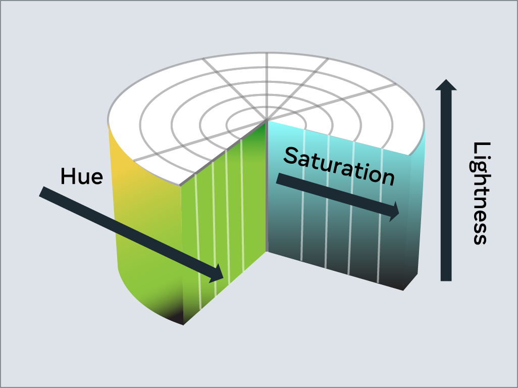
HSL is a newer color model defined as Hue (H), Saturation (S) and Lightness (L). The aim of the model is to simplify mental visualisation of the color that the value represents.
Think of a rainbow that has been turned into a full circle. This represents the Hue. The Hue value is the degree value on this circle, from 0 degrees to 360 degrees. 0 is red, 120 is green, and 240 is blue.
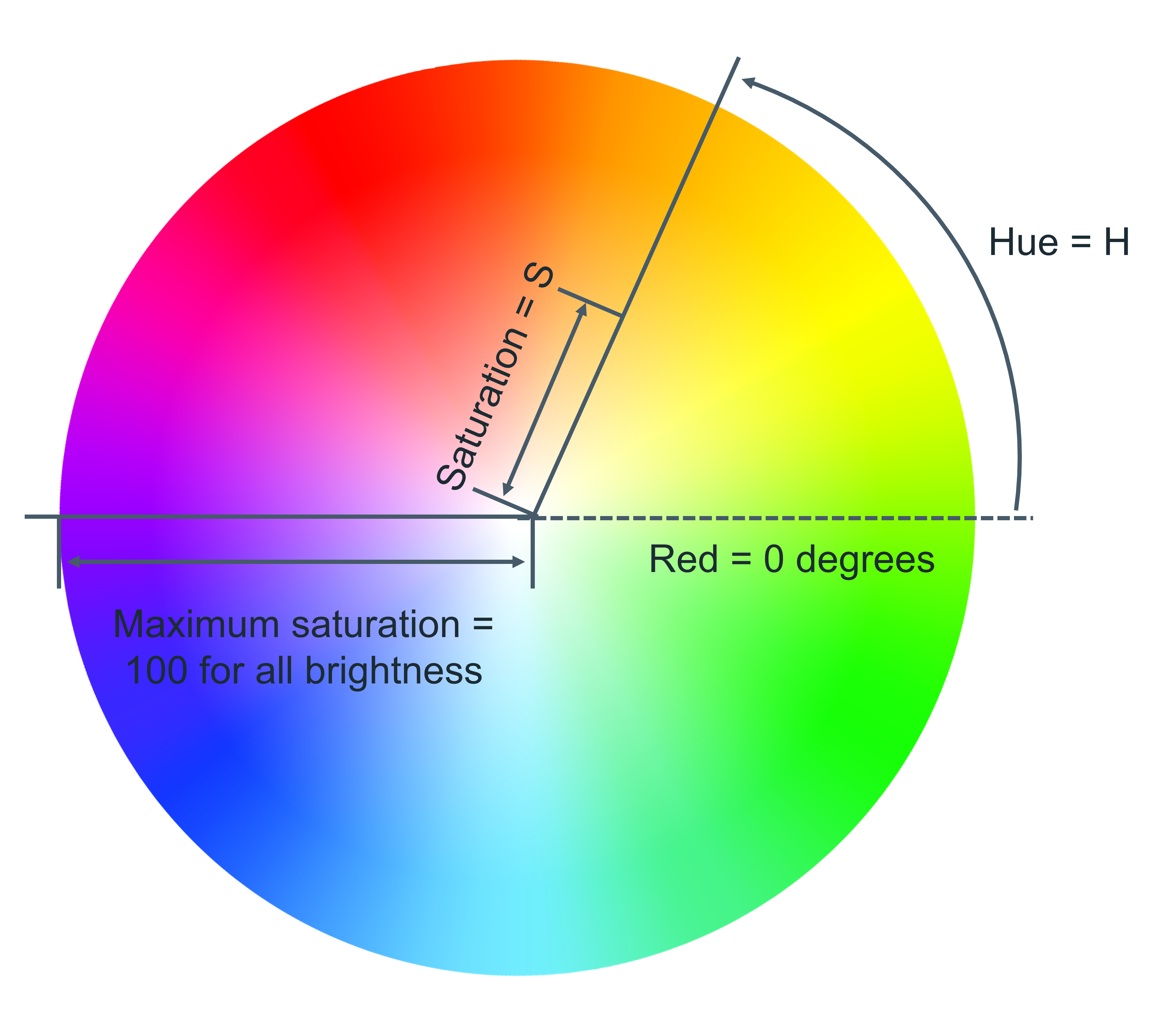
Saturation is the distance from the centre of the circle to its edge. The saturation value is represented by a percentage from 0% to 100%, where 0% is the circle’s centre and 100% is its edge. For example, 0% will mean that the color is greyer and 100% represents the full color.
Lightness is the third element of this color model. Think of it as turning the circle into a 3D cylinder where the bottom of the cylinder is more black and toward the top is more white. Therefore, lightness is the distance from the bottom of the cylinder to the top. Again, lightness is represented by a percentage from 0% to 100%, where 0% is the bottom of the cylinder and 100% is its top. In other words, 0% will mean that the color is black and 100% is white.
In CSS, you use the hsl keyword to define a color with HSL.
1
2
3
p{
  color: hsl(0,100%,50%)
}
Hex value
Colors can be specified using a hexadecimal value.
Colors specified using hexadecimal are prefixed with # symbol followed by the RGB value in hexadecimal format.
For example, the color red which is RGB 255,0,0 would be written as hexadecimal #FF0000.
Predefined color names
Modern web browsers support 140 predefined color names. These color names are for convenience purposes and can be mapped to equivalent hex/RGB/HSL values.
Text
With CSS there are many ways to change how text is displayed.
Text Color
The color property sets the color of text. The following CSS sets the text color for all paragraph elements to red.
1
2
3
p{
  color: red;
}
Text Font and Size
Since computers vary in what fonts they have installed, it is recommended to include several fonts when using the font-family property. These are specified in a fallback order, meaning that if the first font is not available, it will check for the second font. If the second font is not available, then it will check for the third font and so on. If none of the fonts are available, it will use the browser’s default font.
To set the font used by text in CSS you use the font-family property.
To set the size of the font, the font-size property is used.
1
2
3
4
p{
  font-family: "Courier New", monospace;
  font-size: 12px;
}
Text Transformation
Text transformation is useful if you want to ensure the correct capitalization of the text content. In the example below, the CSS rule will change all text in paragraph elements to uppercase using the text-transform property:
1
2
3
p{
  text-transform: uppercase;
}
The most commonly used value for the text-transfrom property are: upperclass, lowercase, capitalize and none. The default value is none, which means the text displays as it was written in the HTML document.
Text Decoration
The text-decoration property is useful to apply additional decoration to text such as underlining and line-through.
1
2
3
p{
  text-decoration: underline;
}
It is possible to set the color, thickness and styling of the decoration too. In the example below, the underline will be a solid red line that is 5 pixels thick.
1
2
3
p{
  text-decoration: underline red solid 5px;
}
The most common text-decoration-line values used are: underline, overline, line-through and none. None is the default value to use no text decoration.
Box model
When an HTML document and CSS style sheet are downloaded, the web browser needs to know how to display the elements on the screen.
To do this, it allocates a rectangle or box to each element. CSS rules are applied to the boxes of the elements.
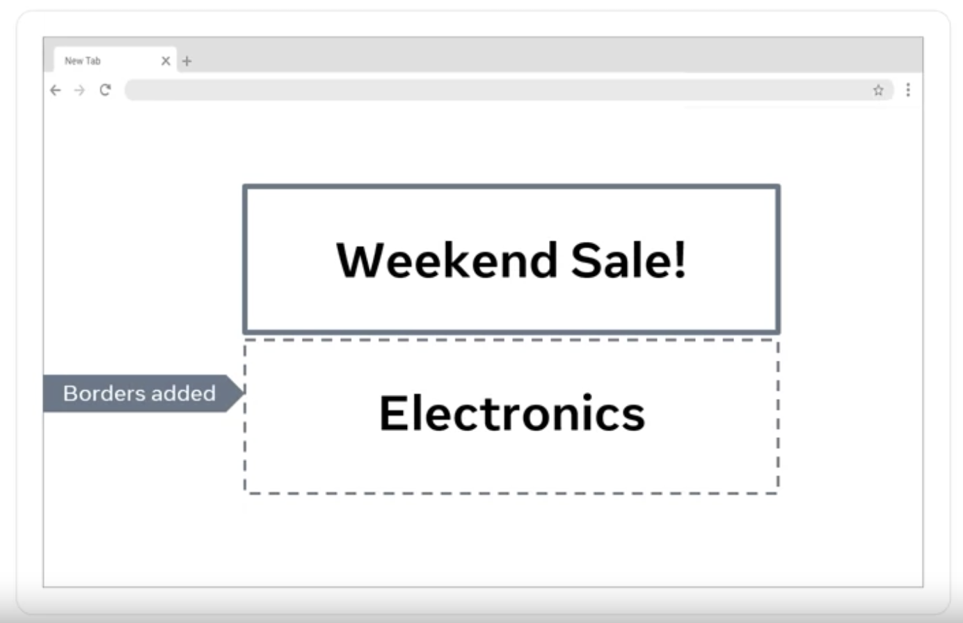
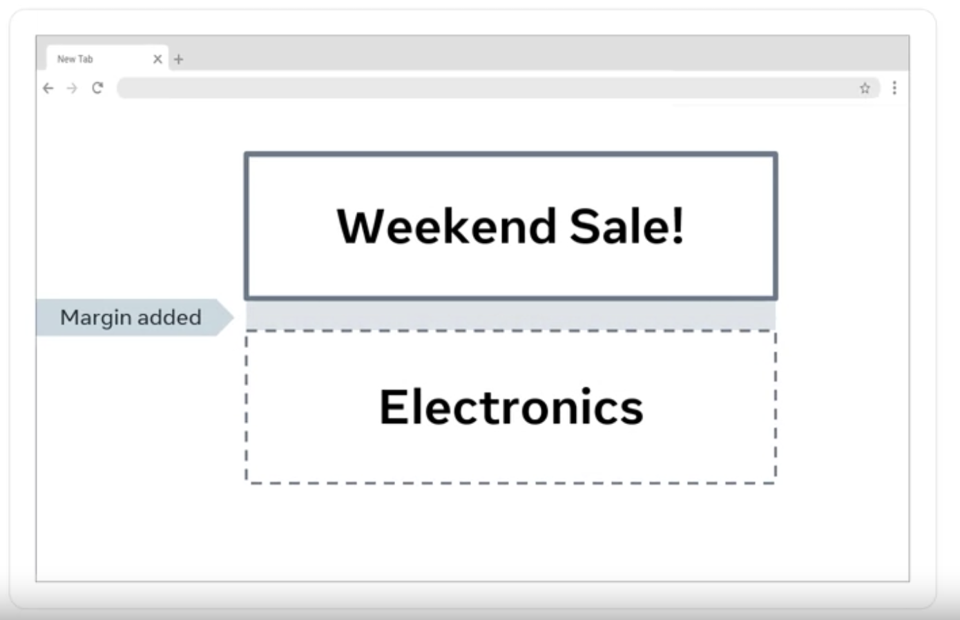
Every box consists of four parts. The content, the padding, the border, the margin.
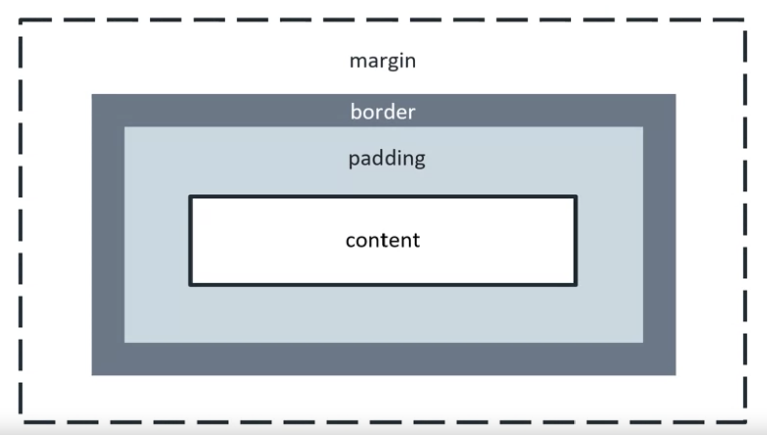
The content is the actual content of the element, like the text or image. Its size is known as the content width and content height.
The padding extends the content size. Its size is known as the padding box
The border goes around the padding and content. Its size is known as the border box width and border box height.
The margin extends the border area to separate the element from its neighbouring elements.
The padding is like the thickness of your clothes. The border is like the silhouette or outline and the margin is the personal space between you and another person.
Inside the box model is the content and around it flows the padding, the border fits around the padding. Lastly, the margin is the empty space keeping elements apart.
Document flow
How does the web browser nowhere to place the elements on the screen?
The web browser’s normal way of calculating the position of HTML elements on the screen is called document flow. By default, nearly all HTML elements are organised into one or two categories namely in block and in line elements.
Block
A block level element will occupy the full horizontal width of its parent element and the vertical height of its content.
Each block level element will have a new line before and after. Therefore, multiple block level elements will stack on top of each other like a stack of boxes.
Line
In line elements only occupy the width and height of their content. They don’t appear on a new line, hence the name in line.
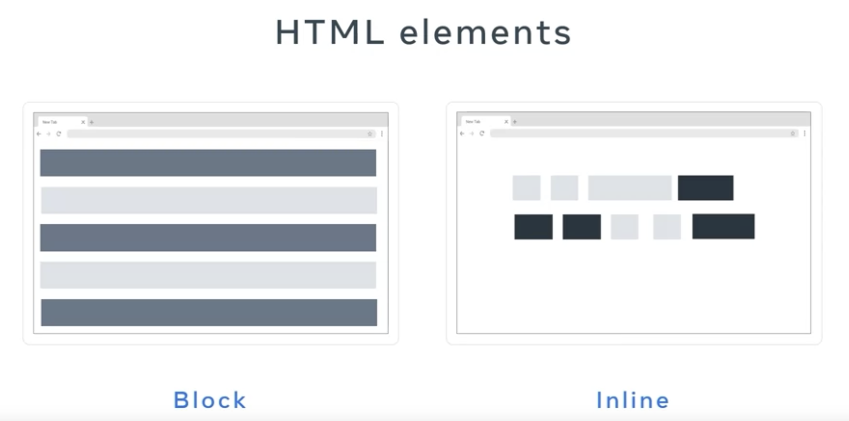
Some examples of block level elements include the tags, div form and heading.
Line elements such as: tags anchor, image, input label, bold, italics, emphasis and span.
Alignment basics
Text Alignment
To align text within an HTML element, you can use the text-align CSS property. In the following example, the CSS rule is setting the text of all paragraph elements to be center aligned.
1
2
3
p{
  text-align: center;
}
Text alignment can be set to left, right, center and justify.
The justify alignment spreads the text out so that every line of the text has the same width.
HTML Element Center Alignment
To center align an element, you set a width on the element and push its margins out to fill the remaining available space of the parent element as in the following HTML structure:
1
2
3
4
<div class="parent">
  <div class="child">
  </div>
</div>
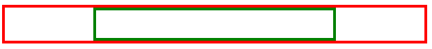
In your CSS, you’ll set the parent element to have a red border to visualise the space it occupies:
1
2
3
.parent {
  border: 4px solid red;
}
The child element will have a width equal to 50% of the parent element with a padding of 20 pixels. Note that padding: 20px is shorthand for setting the padding top, bottom, left and right to 20px. To visualize the space it occupies, set the border to green:
1
2
3
4
5
.child {
  width: 50%;
  padding: 20px;
  border: 4px solid green;
}
To align the element to the center, set its margin property to auto. The auto will tell the browser to calculate the margin automatically based on the space available:
1
2
3
4
5
6
.child {
  width: 50%;
  padding: 20px;
  border: 4px solid green;
  margin: auto;
}
The result is the child element is centered within the parent element.
It is important to note that this works because the div element is a block-level element.
If you want to align an inline element like img, you will need to change it to a block-level element. Similar to the div example, you add the img to a parent element:
1
2
3
<div class="parent">
  <img src="photo.png" class="child">
</div>
The CSS rule then changes the img element to a block-level element and sets its margin to auto:
1
2
3
4
5
.child {
  display: block;
  width: 50%;
  margin: auto;
}
HTML Element Left / Right Alignment
The two most common ways to left and right align elements are to use the float property and the position property.
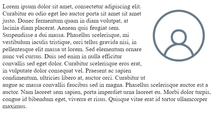
The float property sets an element’s position relative to the text content within a parent element. Text will wrap around the element.
In the following example, the image will be aligned to the right of the div element. The text content will wrap around the image:
1
2
3
<div class="parent">
  <img src="photo.png" class="child"> Lorem ipsum dolor sit amet, consectetur adipiscing elit. Curabitur eu odio eget leo auctor porta sit amet sit amet justo. Donec fermentum quam in diam volutpat, at lacinia diam placerat. Aenean quis feugiat sem. Suspendisse a dui massa. Phasellus scelerisque, mi vestibulum iaculis tristique, orci tellus gravida nisi, in pellentesque elit massa ut lorem. Sed elementum ornare nunc vel cursus. Duis sed enim in nulla efficitur convallis sed eget dolor. Curabitur scelerisque eros erat, in vulputate dolor consequat vel. Praesent ac sapien condimentum, ultricies libero at, auctor orci. Curabitur ut augue ac massa convallis faucibus sed in magna. Phasellus scelerisque auctor est a auctor. Nam laoreet sem sapien, porta imperdiet urna laoreet eu. Morbi dolor turpis, congue id bibendum eget, viverra et risus. Quisque vitae erat id tortor ullamcorper maximus.
</div>
1
2
3
.child {
  float: right;
}
The following displays in the web browser: